My Top Ten Albums 2011

As with previous years, my criteria for the Best Albums of the Year are replayability (I still listen to this album, and years from now, I predict I’ll still be listening to this album) and non-skipability (I don’t skip over many tracks). Your mileage may vary.

10. Move Like This, The Cars. Like 1986 preserved in amber.

9. Noel Gallagher’s High Flying Birds. A pure slab of 1990s BritPop.

8. We Are The Tide, Blind Pilot. Not as good as their first album, but melodic and thoughtful. Music for a Sunday afternoon.

7. Burst Apart, The Antlers. If Radiohead still made rock albums, they might sound like Burst Apart.

6. Celabrasion, Sleeper Agent. This album is like the bouillon cube of indie pop music from the last 25 years. Echoes of everything from the Pixies to The White Stripes is in here.

5. The Head and The Heart. Soulful, singable. “Rivers and Roads” kills me every time.

4. Torches, Foster The People. Leave aside the ubiquitous and overplayed “Pumped Up Kicks,” and you’ll find a record filled with hooky songs worth your time like “Houdini” and “Don’t Stop.” A party album.

3. The King is Dead, The Decemberists. The Decemberists return to form by taking an alt-country tack. Harmonica does them good.

2. The Mistress, Yellow Ostrich. The first time I listened to this album, I was like, What are they doing? Yodeling? Throat singing? But then, wow, you get it. Distinctive sound, great hooks. I defy you to listen to “Hahahaohhoho” twice without yodeling yourself.

1. Um, Uh, Oh, Say Hi. This is the album I always knew Say Hi would make one day. Every song is a gem. Singable, memorable, alternately uplifting and heartbreaking. “Take Ya Dancin'” should have been a huge hit. A real keeper. Sad this hasn’t gotten the recognition it deserves.

Disappointments: Let England Shake, PJ Harvey; The Whole Love, Wilco; The King of LImbs, Radiohead; Bon Iver, Bon Iver; Mountaintops, Mates of State. And yes, I know all these albums are on various Best Of lists. They just didn’t do it for me.

Related: My Top Ten Albums of 2010, 2009, 2008, 2007, 2000-2009, 1990-1999.

My Favorite Design Articles 2011

The best articles on design or the design field I came across in 2011 (in alphabetical order by author):

Blessed are the Toymakers, Tom Armitage

The best toys have hidden depths. The best toys are all super-simple on the surface; super-obvious. They let you know exactly what you ought to try doing with them. But as you explore them, you discover they have hidden depths. And: hidden affordances. Spaces for imagination to rush in. Toys allow you to play games, inventing rules that make the toy more fun, not less. Toys allow you to tell the stories you imagine, not that are baked into them.

From Snarky Truth to Reasoned Explanation, Faruk AteÅŸ

You want to know how to get more women and minority members in your field of work? Stop fighting and arguing against people who are asking for more women and minority members to be recognized. It is precisely these fighting efforts ones that make those groups feel unwelcome.

Emoticomp, Ben Bashford

Interaction designers are used to using personas (research based user archetypes) to describe the types of people that will use the thing they’re designing – their background, their needs and the like but I’m not sure if we’ve ever really explored the use of personas or character documentation to describe the product themselves. What does the object want? How does it feel about it? If it can sense its location and conditions how could that affect its behaviour? This kind of thing could be incredibly powerful and would allow us to develop principles for creating the finer details of the object’s behaviour.

Requirements-Driven Software Development Must Die, Fred Beecher

Requirements-driven software development fails mainly due to communication issues. Huge spreadsheets of detailed requirements, by themselves, are simply not an effective way to convey what an interactive system needs to do and how users need it to work. What does work, however, is validating those requirements with an interactive prototype.

7 Things Michael Bierut Loves About Design, Michael Bierut via Helen Walters

Asked to create a logo for the Frank Gehry building, Bierut came up with a series of solutions that the client absolutely hated. Having presented one idea, he recalled, “they were supposed to see it and ask ‘how can we thank you?’ Instead the question was ‘is this supposed to make us feel nauseous?” In the end, the company founder Michael Tilson Thomas sent a series of his own scrawled ideas. Usually a cue for designers to feel uppity and upset that a client is trading on their toes, Bierut welcomed the input, and used it to come up with the final (gorgeous) solution.

Seven Things Designers Can Learn from Stand Up Comics, Michael Bierut

Good comedians experiment constantly. Every time they test a new joke, they risk bombing. That’s why they’ll try out new material in smaller venues, polishing pieces in front of live audiences: they need to hear what’s working and what’s not working. Seinfeld admits that when he was starting out, “I was hitting 500. I would have a good show and a bad show, a good show and a bad show.” His very first show was bad. “But success wasn’t my objective.” He was desperate to simply be on stage, and was willing to risk failure every other night to get there. Designers take risks for the same reasons. Trying something new means not being sure of the outcome. But it’s the only way that anyone working in a creative field can hope to make progress. Ambition is a strong enough antidote to fear. Louis C.K. remembers how he idolized good comics: “I wanted to be one of them, and I didn’t care if I sucked at it.”

What The Telephone’s Unbeatable Functionality Teaches Us About Innovation, Stefan Boublil

Design has become almost useless to mankind since so few people pursue single-mindedness as a foundational purpose, but would rather purposelessly chase multi-functionalism down a dark and long tunnel that may well lead to magazine covers, but to little else.

How to Lead Clever People, Karen Christiansen and Rob Goffee

You touched on the fact that unlike artists or musicians—who can thrive on their own—clevers actually need organizations to thrive. Why is that?
Typically, they need to work with other clevers in order to generate new products and knowledge. In many cases they are actually motivated by working with others who may be even cleverer than they are. We talk about Google in the book. I went to visit some of the people there at the headquarters in California. Not surprisingly, they are hiring the brightest postdoctoral students and researchers in the world; that’s who gets to work at Google. And guess what the first thing they notice when they arrive is? ‘Everyone here is cleverer than me!’ This is motivating for them, because clevers thrive when they feel surrounded by people just the same or even cleverer. That’s one of the reasons they need organizations. There are also more pragmatic reasons: they also need resources and they need organizations as a platform to achieve recognition.

Convergence 2.0 = Service + Social + Physical, Hugh Dubberly

Convergence 2.0 recognizes that interactive multimedia exist within a networked world and depend on networked services. It recognizes that most services have a social component. And it recognizes that people are rooted in the physical world and networks are increasingly connected to things. Convergence 2.0 integrates interactive multimedia with internet-based services, social networks, and the physical world.

Fundamental Design Truths, Uday Gajendar

Every design involves compromises, trade-offs, constraints : This is just a hard fact of design practice, period. You can’t get everything 100% due to the social and political complexities of…working with people 🙂 The pragmatics of any design problem require understanding of and wrestling with constraints (technical, commercial, social, etc.), negotiating various trade-offs (since no design is perfect, see above) which then forces critical debates about what is most important (prioritizing content, functionality, features, so forth) to the product & user & business. This debate is what should lead to a well-guided strategy adapted over time. The ability to artfully compromise to achieve goals for all stakeholders is at the heart of any design.

Copycats, Matt Gemmell

The issue is that real design jobs aren’t about creating something absolutely new—instead, they’re about innovation. The etymology of the word ‘innovation’ means something like “renewing”, or changing an existing thing by adding something new or doing something differently. Not a clean-cut, start-from-scratch scenario – that’s not what innovation is, and that’s why it’s hard.

Hand waving and the “real work” of design, Elizabeth Goodman

“Hand waving” is a pretty apt description of what interaction designers do with clients. Typically, those meetings are intended to review the course of the project and decide what to do next. These decisions are generally based on representations of the planned future system, such as wireframes, visual comps, flows, site maps, paper sketches, etc. The problem is that there’s an inevitable gap between representations of what is to be built and the experience of the finished product. This is most obvious when you think about the difference between static wireframes and interactive systems. But the problem lies deeper. If you see the goal of interaction design as supporting human goals and activities through various interactions between humans and machines, then even a clickable prototype will not match the experience of the live system. Imagine Amazon without the recommendations, or World of Warcraft without the thousands of players per server. Hand waving—ie, a combination of verbal explanations and evocative body movements—is a way to bridge that gap between intermediate representations and the experience of the built system. Hand waving supplements visual representations in order to make up for what they lack – interactivity, movement, emotionality, etc.

Minimal Viable Personality, Grimlock

PERSONALITY IS API FOR LOYALTY. NO ONE CARE WHICH BORING STRANGER IS NEXT. BUT ALWAYS WANT FRIEND NEXT.

Portable Cathedrals, Dan Hill

Each mobile phone handset is not a mere product, perhaps like the other products that have traditionally adorned the pages of this magazine—as a chair is, or a lighting fixture is. Instead, each handset is a play in a wider global contest, a node in logistics networks of immense scale and complexity, a platform for an ecosystem of applications, an exemplar of the internet of things, a window onto the daily interactions of billions of users, of their ever-changing personalities and cultures, a product that consumers traditionally consider the most important in their possession, after the keys to their home.

The phone is an intimate device, not simply through its ubiquity and connectivity, its relationship with the body. While objects have long been cultural choices and symbolic goods, the mobile phone, being the most personal connection to the internet, is a device for generating symbolic goods, a vehicle for culture, a proxy for the owner’s identities. It is vast business and cultural phenomenon, all at once.

The Robot-readable World, Matt Jones

Computer vision is a deep, dark specialism with strange opportunities and constraints. The signals that we design towards robots might be both simpler and more sophisticated than QR codes or other 2d barcodes.

How Print Design is the Future of Interaction, Mike Kruzeniski

The literal analog affordance is no longer necessary, and yet, it’s the default path that so many interactive experiences follow. We don’t need to make an eBook look like a book for people to understand how to use it. The book isn’t the cover and binding, it’s the images and the text that make the story. Similarly, a movie doesn’t need to look like a DVD on a shelf to understand that it belongs to a collection, and an audio mixer doesn’t require cables and knobs to be capable as a tool, and a Notebook does not require leather and a spiral bind to be familiar. In the early days of interaction design when software concepts were best explained through heavy handed metaphors, the familiarity of these objects and textures was appropriate. However, the rendering of artifacts has outlived its usefulness as the definitive approach to UI design. As Designers we should be critiquing it for what it often is: shallow, meaningless, and often distracting from the information it surrounds.

Checklist Thinking for UX Professionals, Greg Laugero

Key to success is public visibility of the connections among deliverables. For instance, when showing page flows, start by showing the user stories as a setup for the flows. Or if you are developing user stories, start by reminding everyone of the personas and scenarios. This ensures you have the best chance of making sure the next deliverable is as complete as possible. You also can more readily identify new scenarios, requirements, and user stories without feeling defensive, or like you missed something. If you’re doing this right, you should start to hear your clients say, “This sounds like a new user story!” when new functionality inevitably comes up.

Why Angry Birds is So Successful and Popular: a cognitive teardown of the user experience, Charles L. Mauro

What makes a user interface engaging is adding more detail to the user’s mental model at just the right time. Angry Birds’ simple interaction model is easy to learn because it allows the user to quickly develop a mental model of the game’s interaction methodology, core strategy and scoring processes. It is engaging, in fact addictive, due to the carefully scripted expansion of the user’s mental model of the strategy component and incremental increases in problem/solution methodology. These little birds are packed with clever behaviors that expand the user’s mental model at just the point when game-level complexity is increased. The process of creating simple, engaging interaction models turns out to be exceedingly complex. Most groups developing software today think expansion of the user’s mental model is for the birds. Not necessarily so.

How to Pick the Right Clients, Mike Monteiro

Over the years the one constant that we’ve been able to rely on is that how a potential client behaves in the business development process is EXACTLY how they will behave during the project. Trust your gut. If they’re slow to return your calls now, while they’re trying to engage you, they’ll be just as slow later. If gathering requirements or success metrics is hard, then gathering feedback will be just as hard, if not harder. If biz dev turns into a May Day parade of red flags then disengage. You will not be able to do good work, and neither you nor the client will be well-served.

The A-B-C of Behavior, Jodie Moule

We all seem to be talking about changing behaviour through good design…but changing behaviour is actually really hard. Working as a psychologist in a detox unit at the start of my career has admittedly shaped my view of what it takes to change someone’s behaviour; and whilst I learnt it certainly isn’t impossible, it often takes time. Combine this with the fact that most human behaviour is not considered to be overly planned, with ‘conscious thought’ playing, at best, a small role in shaping our choices…things start to become a little tricky for us as designers. So how do we start to make sense of what influences someone to change their behaviour, given we are often charged with creating designs that are ultimately intended to encourage, if not drive, some form of behaviour change?

Act First, Do the Research Later, Don Norman

Today we teach the importance of doing design research first, then going through a period of ideation, prototyping and iterative refinement. Lots of us like this method. I do. I teach it. But this makes no sense when practical reality dictates that we do otherwise. If there is never enough time to start with research, then why do we preach such an impractical method? We need to adjust our methods to reality, not to some highfalutin, elegant theory that only applies in the perfect world of academic dreams. We should develop alternative strategies for design.

Post-rationalization is An Innovator’s Best Friend, Adam Richardson

It is one thing to have the idea, quite another to understand its possibilities and implications. Some lightning bolt inspirations are indeed junk, but some of them really strike at something valuable. It’s just not always clear what that value is.

The Metaphor of The System, David Sherwin

The holy grail for any product or service designer is to be able to elegantly describe the metaphor of the system, then prove it out through usage scenarios. In some design presentations, it can take a single word or phrase to eloquently connect key moments in a system’s information architecture, interaction design, and visual design. When you encounter a system design with a compelling, unifying interaction metaphor, you can often detect that metaphor through the “iceberg tips” of wireframes, prototypes, or animatics. And when users interact with the system in testing, they often react to how those details weave together into a (hopefully) cohesive whole.

Bless The Toolmakers, Robin Sloan

So I wish more people were making tools for a specific creative purpose rather than for general consumer adoption. I wish more people were making tools that very intentionally do not scale—tools with users by the dozen. Tools you experience not through a web signup form, but through pathbreaking creative work.

I guess I want fewer aspirational Apples and more Pixar wannabes.

Creating Great Design Principles: 6 Counter-intuitive Tests, Jared Spool

Great design principles help designers learn more about their design and make critical decisions about what they’re building.

The Ten Principles of Interaction Design, Chad Vavra

To steal a metaphor from E.L. Doctorow, “[Interaction Design] is like driving a car at night. You can only see as far as the headlights, but you can still get to your destination”. When a task seems too big, start by picking two things, like a page and a button. Establish their relationship and interaction. Once that is done, pick something else that relates and keep going. Everything will come together thanks to the brain’s natural ability to spatially model the world.

A Brief Rant on The Future of Interaction Design, Bret Victor

Pictures Under Glass is an interaction paradigm of permanent numbness. It’s a Novocaine drip to the wrist. It denies our hands what they do best. And yet, it’s the star player in every Vision Of The Future.

How Much Design is Too Much Design?, Khoi Vinh

If you look across the digital landscape, the most exquisitely designed user interfaces and the most comprehensively designed user experiences are rarely the most successful. On the other hand, the most successful network products make good use of design but are usually not high watermarks for design execution. Flickr and Facebook, to name two, are both very well-designed but employ only just enough in the way of intricately polished user interface elements and highly controlled layouts to succeed, and stop short of over-managing their details. Products like these are savvy enough to allow sufficient room for a user to live within them, to flex his or her muscles and breathe freely within the product’s architecture. They’re also the result of considerable iteration and improvisation, and sometimes they show that fact almost baldly in their patchwork agglomeration of mismatched features. No one would call them beautiful but they work phenomenally well and users love them.

You Are What You Eat, Trent Walton

Eat one meal, then another, and over time that stuff becomes who we are. It’s used to heal skinned knees, grow fingernails, and rebuild tired muscles. I find that thinking of work in a similar fashion can be used to one’s advantage. When a job is done, we’re left with experience, new skills, and a sharpened perception. Do work that you enjoy so you can be good at what you love.

Our Jobs in Cyberspace: Craft Vocabulary vs. Storytelling, Jeffrey Zeldman

But the longer we practice, the more intuitive our work becomes. And as it becomes more intuitive, it disconnects further and further from language and constructs.

Any other article that should be on the 2011 list? Note it in the comments!

N.B.: Either women should write more about design, or I should be reading more of their writing. Woefully under-represented on this list. Who should I be reading?

Related: See my 2010 picks

My Top 25 Albums 1990-1999

25. Odelay, Beck (1996)

24. Nevermind, Nirvana (1991)

23. OK Computer, Radiohead (1997)

22. 69 Love Songs, The Magnetic Fields (1999)

21. Little Earthquakes, Tori Amos (1991)

20. Urban Hymns, The Verve (1997)

19. What’s The Story Morning Glory?, Oasis (1995)

18. Keep It Like a Secret, Built to Spill (1999)

17. Whatever & Ever Amen, Ben Folds Five (1997)

16. All This Useless Beauty, Elvis Costello (1996)

15. Garbage, Garbage (1995)

14. Elastica, Elastica (1995)

13. Zooropa, U2 (1993)

12. Doubt, Jesus Jones (1991)

11. 14 Songs, Paul Westerberg (1993)

10. Together Alone, Crowded House (1993)

9. Never Loved Elvis, The Wonder Stuff (1991)

8. Goodbye Jumbo, World Party (1990)

7. Exile in Guyville, Liz Phair (1993)

6. Electro-shock Blues, Eels (1998)

5. Nirvana Unplugged, Nirvana (1994)

4. Celebrity Skin, Hole (1998)

3. The Bends, Radiohead (1995)

2. Achtung Baby, U2 (1991)

1. Different Class, Pulp (1995)

In Praise of “Moving Stuff Around”

I was on my fifth revision of a search screen. (In my defense, it was a complicated search, with lots of variables.) The client said to me, in what might be my favorite comment of all time, “But you’re just moving stuff around!” Yes, I admitted rather sheepishly at the time, I was doing just that.

After the meeting ended, I realized I had no need to feel embarrassed. “Moving stuff around” is a lot of what design does: providing structure, hierarchy, and cues for understanding via positioning. But without justification and explanation, it can look like just fiddling.

I remembered this anecdote when I saw this 1972 interview with the legendary Charles Eames, in which he offers up his definition of design as:

A plan for arranging elements in such a way as to best accomplish a particular purpose. [emphasis mine]

If Charles Eames can put arranging elements aka “moving stuff around” as the core activity of design, then so can I. There is a value in putting objects such as controls into an understandable configuration. This is, in fact, the exact service many designers provide. Embrace it.

Never Waste a Project Lull

The nature of project work is that there are often periods of inactivity—both during the project (while waiting for feedback, for example) and between projects. It’s easy to piss away these lulls—you’re exhausted from doing the project after all—but you can also use the time productively by hunting and gathering.

Hunting involves finding new experiences to fill up the creative tank. The best creative practitioners are often those who can draw ideas from other fields, to make disparate connections to find solutions. Trying something different, even if it is just a new restaurant a little farther away, can provide new ideas, new stimulus. “Too often, we fail to consider the ways in which our surroundings constrain our creativity,” writes Jonah Lehrer. Doing or seeing something new stretches our creativity and gives us more raw material to work with when we return to work. You don’t have to skydive or travel to Bhutan, you just have to experience something not usually in your path. Whatever you do, don’t just sit at your desk, mindlessly surfing the internet. “We don’t know where we get our ideas from. We do know that we do not get them from our laptops,” notes John Cleese. Exactly.

Gathering involves reflection, thinking about the work that has already been done and figuring out the lessons learned. Especially if you write your thoughts down, gathering gives you another source of raw material: for blog posts, for presentations, and just for understanding your own work. Sometimes a pause lets you examine not just what, but how you did something, and why. (Definite shades of Donald Schön’s The Reflective Practitioner here.) If you can’t reflect on your work, and in particular the mistakes you made while doing your work, you won’t grow.

Everyone fixated on the 10,000 hours of practice to become an expert that Malcolm Gladwell illuminated in his Outliers book. But what he pointed out (and that everyone forgot) was what that what you did during those 10,000 hours mattered. Practice entails doing an activity, then honing it through reflection. You can do an activity for 10,000 hours and still suck at it if you’re not thinking about what you’re doing, then correcting your mistakes. A project lull is a perfect time to do this sort of gathering.

So yes, while you could dull yourself with ‘net surfing, YouTube watching, and general goofing off (all of which has its place as well), you could take some small steps to better yourself, so that when project work resumes, you’re ready.

Save Save As

A Golden Rule of interaction design is that if you change an interface convention, the replacement had damn well be better than the convention you replaced. Demonstrably better. By this standard, OS Lion’s “Save As” replacement “Save a Version” fails. Epic Fail, in fact.

In Ye Olden Days of GUI (Apple’s Lisa and the Xerox Star), “Save” used to be “Save and Put Away” (Xerox Star) or (as an option with Save and Put Away) “Save and Continue” (Apple Lisa). “Save and Continue eventually just became “Save” while “Save and Put Away” vanished, probably once RAM and memory allowed for multiple documents to be open at the same time without processor issues. “Save As” seems to have begun in the 1980s as “Save a Copy as,” and eventually some applications had all three: Save, Save As, and Save a Copy as. (What the difference between Save As and Save a Copy As are unclear to me.) Eventually, as people understood the Save As paradigm and with the broad adoption of the Undo action, “Save a Copy as” has mostly vanished. You can still occasionally see “Revert to Saved” in file menus.

In any case, the mental model of Save As has been fairly stable for at least 30 years now. You change the document, then you give it a new name. Apple’s new model seems to be the reverse: I’m going to change this document, so I need to Duplicate it, then change it. Old versions inexplicably lock, although I’m at a loss for when and why. (At least I think this is how it works: the mental model makes no sense to me.) Ostensibly, this is because Apple has an autosave that let’s you go back to previous versions. They thought somehow this would obviate the need for Save As.

But this is not how most people work (or, more precisely, how we’ve been trained to work over the last 30 years). This change breaks the mental model hard and replaces it not with anything better, but with a paradigm that is very difficult to understand (and poorly executed to boot). Most people don’t need the previous version of their document open at the same time as the altered version. Versioning is what programmers do, not what normal people do. When I (infrequently) need the earlier version of a document, I’ll manually open it. When I initiate a “Save As” I’m explicitly saying “This is a new thing, made from the previous thing. It’s a separate entity, deliberately established by me, not a “Duplicate.” I don’t want to “Save a Version,” I’m really making a new version, often one that involves putting this new version into a different folder. With Save a Version, I’m ending up with all these weird copies of documents that are difficult to determine which one is the most recent. Is it the “copy?” I don’t know.

Here’s a test, interaction designers. If you can’t easily diagram the logic of a feature, no way in hell are users going to figure out the mental model of it, unless you provide some easy means of making a “false” model that nonetheless allows users to figure out what is going on. This feature can’t be diagrammed easily (I tried) and the terminology around it doesn’t provide clarity.

This is the first time in a long time I’ve felt something that makes sense only for programmers has made it into an Apple UI. There’s no way Steve Jobs signed off on this change. It’s either too complicated, executed badly, or explained poorly—or all three—and those are not attributes I expect from Apple design.

9/11 Year 10: My 9/11 Experience

On the morning of September 11, 2001, I was on a train bound towards Manhattan as terrorist-piloted planes struck the towers of the World Trade Center—my destination. I somehow (foolishly) managed to get to lower Manhattan where I became tangled up in the events of that horrible day. It took me more than 24 hours to get home. This is the (mostly-unaltered) account I wrote in a notebook the following day.

September 12, 2001, 11:55 am.

I should probably write down as much of this as I can before I forget it or my recollection of my day becomes mixed up with the media coverage. It’s probably too late for that last thing…

It’s a beautiful Wednesday. It’s Fiona’s [my daughter’s] first birthday. My father had surgery yesterday. And yesterday, the World Trade Center towers in Manhattan were destroyed. I watched from a rooftop as the North Tower fell. I don’t think I have ever seen anything so awful.

I’m writing this on a train in the Hoboken Terminal, after 24 hours of trying to get home. But I’ll start from the beginning.

Yesterday started out the same as any other day. I got up early with Fiona, who had had a restless night because of her teeth coming in. She’d woken up several times, so Rachael [my wife] and I were both tired.

I made the worst mistake I would make all day that morning. I had started work at a new job the day before and had had to wear a suit for a client meeting. Since the company, Funny Garbage, was hip and funky (if you couldn’t tell from the name), I was determined to wear hip, funky, casual clothes: jeans, a patterned shirt, and my blue shoes. These shoes were not made for walking, just for style. I would end up walking over six miles in them. My feet are killing me now—they are blistered and swollen.

That morning, I also packed up [in a paper bag] a number of personal things to take to work—books, mainly, but also some photos and desk junk. Running to make the 9:00 train, the handle on the bag broke, so I just had to carry it.

The train ride was normal at first until Rachael called me on my cellular phone. “Don’t go to the World Trade Center,” she told me. “Heather [her sister] called from Spain and said a plane had crashed into the World Trade Center.” “Seriously?” I said. I really didn’t believe it. I said I would go uptown instead. I had been planning to go to the WTC [via PATH], then change to the N/R train to get to Funny Garbage, on Spring Street in SoHo. I had too much stuff to carry, I figured.

But then other [passengers’] cell phones kept ringing, and people getting on at other stations were talking about it. We didn’t really know how bad it was until we saw it out the train window. The two towers spewing smoke like two cigarettes. “It’s like a movie,” everyone kept saying. “Jesus Christ,” was what I said when I saw them. [From our vantage point] you could clearly see a giant gaping black hole in the side of the north tower.

We got off the train to panic at the [Hoboken] train station. People were already getting on trains to go home. [Which is exactly what I should have done.] Undeterred and, I guess naively, I walked down to the PATH trains, even though someone said no one could get into Manhattan. I got on a waiting PATH train and amazingly, it went into the city. One Japanese woman, a tourist, asked a man how to get to the World Trade Center. He gently told her that she probably didn’t want to go down there today.

I got off at 9th Street [at 6th Avenue] and immediately saw crowds of people in the street, looking at the towers. Or rather, tower. Only one was standing [the north tower] but I didn’t know that. There was so much smoke you couldn’t see the south tower from my vantage point. It wasn’t there to be seen.

I started the over a mile walk to Spring Street [and Broadway]. People stood in the streets, staring. Some gathered around TVs in street-level apartments or around cars that had their radios on. People were streaming up from downtown [TriBeCa and Wall Street] on foot. I tried calling Rachael, but cell phone service didn’t work. My battery was soon low, so I was forced to turn my phone off.

I made it to my office. Because it was only my second day, I didn’t have any keys. Someone gave me a set, so I was able to unlock the door and get to my desk.

I left my personal stuff at my desk and, finding some stairs, went up onto the roof. There, a few minutes later, I watched the north tower collapse.

I don’t think it’s a sight I will ever forget. The top of the tower started flaking away, chunks of the grid-like outside of the building, then the huge antenna [on the top] tilted then sank, as did the whole top of the structure, into smoke. The sound was like a huge groan and a whoosh as the building vanished. Then there was a moment of absolute silence and all I could see was a stripe of blue sky where the building once was.

Then the gasps and the cries. I was silent, stunned. I was simply dumbstruck. I could not believe what I saw. It seemed like a dream—a horrible dream.

[One thing I’ve remembered since then: I heard someone screaming as the tower collapsed, and it took me a second to realize that it was me.]

The next few hours were spent watching a television that was in the office and trying to figure out how I was going to get home. With the office closing, the bridges and tunnels closed, and no mass transit, I was stuck.

After several phone calls and waiting, I decided to make my way to my friend Sylvia’s apartment in Park Slope, Brooklyn.

[One other memory that has stayed with me from this point in time is the roar of fighter jets flying overhead. To this day, I can’t stand that sound.]

The walk from my office to Sylvia’s was four miles. It was another scene that would have been unimaginable the day before. Thousands of people streaming out of Manhattan on foot over the bridges. I walked over the Manhattan Bridge, one of a sea of humanity. The bridge was closed to traffic, so we walked in the street. The Red Cross was there, handing us water before we got on the bridge.

Where the World Trade Center had been now was only a twisted ruin of metal and stone, throwing up a huge plume of grey and black smoke that curled up over the city and stretched deep into Brooklyn. The cloud of smoke sometimes changed the sun into a burnt orange disk.

As I was midway across the bridge, a loud rumble shook the street and everyone stopped, scared. But it was only a subway passing below us. Fear was like another particle in the air. We were like refugees fleeing from a war-ravaged city. Which, I suppose, we were.

I made it to Sylvia’s and spent the night there along with her brother and sister-in-law who were visiting her from Iowa and had gotten stuck due to the grounding of all airplanes.

This morning, I was able to take a subway, then PATH, then the train home. The faces of my wife and one-year-old daughter were the best things I had ever seen.

[There ends my account of the day.]

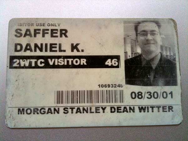
One final anecdote I want to share. I’d been laid off in May 2001 (from my job across the street from the WTC), so that summer, I was interviewing for jobs (including the one I eventually got). One of the jobs I interviewed for was at a company (unfortunately named) Soft and GUI, which did work almost exclusively for Morgan Stanley. Their office was embedded with Morgan Stanley—in the South Tower of the World Trade Center, floor 72 if I remember correctly. Which was directly below where United Airlines Flight 175 struck (floors 77-85). I interviewed there on August 30, and, had I gotten the job, September 10 likely would have been my first day at work. I was even joking about a terrorist attack as I was going through security on August 30, where they snapped this photo. I found this card about three years ago in the bottom of a box:


I carry this card in my wallet now to remind me that life is short and we don’t know when it will end. As much as we all like to imagine ourselves dying at a ripe old age, the truth is you can die today, just doing your usual routine, going to work. That’s the real lesson of 9/11 for me. Things you can see as a disappointment (like not getting that job you interviewed for), can actually save your life. We don’t—can’t—see the Big Picture, but we have to pretend that we do to get through the day. The Big Picture doesn’t care about you or your needs, hopes, and dreams. Occasionally something happens, a 9/11, to remind us of this. But we have to carry on; there’s only one alternative, and that’s not pretty either. After all, the only thing that actually kills us is what kills us. But that could happen today, right now, so make what you’re doing with your life matter. You can’t stop The Big Picture. It keeps moving, drawing an incalculable number of variables together. The only thing to do—the only thing worth doing—is to try to live with meaning, so that if today is the last day of your life, as it was for thousands on September 11, 2001, those who knew you will mourn.

Related Posts

Windows 8, The Ribbon, and Designing with Data

I was going to call this post, “Thinking the Unthinkable about Microsoft,” but what I’m going to say isn’t really unthinkable. In fact, I’ve thought it several times in the past four years, starting with Office 2007 and the introduction of The Ribbon as a UI element and continuing on through Kinect, and Windows 7 Mobile. What I’m thinking is namely this:

Microsoft is doing some good design work, particularly interaction design work.

I know, right?

Let me preface this piece by saying I’m mostly an OS X user, with occasional forays into Windows 7, which I don’t particularly like. I use MS Office just like most of the planet, however.

What prompted this post was a post on the MS blog about adding The Ribbon to Windows 8 Explorer. It’s a fascinating piece, and kudos to Steven Sinofsky and Microsoft for publishing it. We so seldom get to see design decisions as they are being made and the data—data!—that is being used to make them. Can you imagine Apple or even Adobe doing this? Me neither.

Of course, it being Microsoft, there was an immediate slam that quickly spread around the interwebs. The gist of the criticism is that Microsoft’s own data is showing how their new design is stupid. First, some quick background:

I know a lot of people hate The Ribbon as a UI element. It definitely took me a while to get used to it as well. But if you watch Jensen Harris’ The Story of The Ribbon or read the Office 2007 blog (recommended), it gives you an idea of the kind of constraints they were working under and their reasoning for creating for The Ribbon. Working on software with an established user base in the hundreds of millions is no easy task. Add to that organizational pressures, the hundreds of features you need to include because of business and power-user requests/demands, and you have a difficult design challenge, the likes of which most designers will never face. Hell, most designers within Microsoft didn’t fully address the challenges Office presented, which is how we got Office 2003. It’s a significant challenge, and if you don’t think so, try redesigning MS Word yourself, given what you know about the internal constraints. And then present your radical redesign of a company cash cow to Ballmer and Gates. Most of you would wet yourselves in response. I contend that The Ribbon was a bold, excellent response to the challenges of Office. I’d be proud to have it on my resume.

Now, whether The Ribbon is a good choice to use within the operating system and not within the suite of Office apps (where it was designed to be) remains to be seen. Sinofsky says in the article they explored other UI means, but eventually settled on the Ribbon as the way to go.

Now back to the data. Microsoft anonymously collects user behavior data, which can be illuminating. It basically helps determine what goes into the Ribbon on any given screen. Note that I said helps. Because here’s the thing about data: it can’t design for you. You need a human being—a designer—to interpret the data, and then place it into context. The data needs to be made meaningful, which sometimes means ignoring it.

Ignore it? WTF! Why would you ever ignore data? Here’s the simplest example: most online advertising isn’t clicked on. If you get a .5% clickthrough rate, you’re often doing very well. So should we remove all online ads, since they are so seldom used? 99.9% of users think so (the other .1% of people work for advertising agencies). But getting rid of advertising for some sites would mean basically getting rid of the site itself. Would you like Google to go away? You can’t listen to the data because the data doesn’t understand the overall context: the business and organizational environment and the user base as more than numbers on a spreadsheet.

There are plenty of reasons why a designer wouldn’t just make all the highest-use items visible:

  • You’re trying to increase the use of a feature. Some features people clamor for are buried and thus have low usage. Bringing them forward and making them more prominent is a way of encouraging greater use.
  • You’re helping power users. A tiny sliver of your audience might be power users, so overall, it looks like the usage percentage is low. But those power users really need that feature and will scream bloody murder if it is hard to get to.
  • Clustering the same kinds of commands together. Probably almost no one uses a command like Paste as Hyperlink, but users wouldn’t be wrong to expect Paste as Hyperlink to be near Paste.
  • A feature is part of a workflow. Occasionally, several commands will typically be done in a sequence. For example, scaling after importing an image. Now, users might not scale every time (and thus the use data is lower), but a good designer will know the flow regardless of what the data seems to be saying and design for the flow.
  • You’re introducing a new feature you think people will like, but there’s no user data for it yet.

In short, data can be misleading and needs human interpretation. It can be a mistake to do a one-to-one mapping of high-use items onto the home screen. If you don’t believe me, look at Office 2003, because that’s the solution they tried there. You can end up with cluttered, non-sensical screens that (especially your power) users will hate.

Note that this is not to say that data cannot be misinterpreted by a designer, sometimes willfully so. (See my talk How to Lie with Design Research for helpful tips on manipulating data.) Designers are all too human and make mistakes too.

But before you look at behavioral data mapped to a UI (which is an amazing giveaway in the first place) and make judgements about how the data was utilized, realize you’re only seeing part of the picture. What you’re missing is the constraints, a knowledge of the users, and the organization and product history that a designer will bring to bear on the problem. Designing with data should mean using data as an input to your decision-making, not as the decider alone.

Help Me Find My Next Adventure

I’m looking for a new professional home. I’ve been talking to some interesting companies, but I thought it might be good to spread the net wide.

I’m looking for a position leading a team of designers as a creative director, director of design/UX, or VP of design in San Francisco or nearby. (Or one that would allow me to work in SF remotely.) I enjoy the pace of agency life, but would equally like a really interesting product. Dog-friendly office a plus!

My preference is to working on consumer projects that go beyond web or a single app, preferably in the hardware/software space: devices, robots, consumer electronics, appliances, etc. I’m an expert in touchscreen and gestural interfaces, as well as web, mobile, and desktop apps.

Here’s my resume (pdf) and my portfolio. Contact me if you have or know of a good fit for my experience and interests. Thanks!

Lessons from the First 50 Days of 100 Days of Design

Fifty days ago, on March 1, I started a 100 Days of Design challenge. Basically, the idea is you do one design exercise once a day, every day, for 100 days. By sheer repetition, you get better at whatever it is you do; over time, you see more facets to the activity, more variations. It’s like scales and etudes. But it’s also difficult; most (all?) of the people who started the challenge with me have stopped.

Every day, I spend about 15 minutes doing a small (6″x6″) expressive typography piece, based on a music lyric I heard that day. I put them all together on one giant poster that will be 10′ tall when I’m done.

I think it’s a worthwhile challenge and I feel I’m getting better at thinking in type. So what I have I learned by doing it thus far? A few things:

  • Watch for happy accidents. Every once in a while, I’ll accidentally do something while playing around and it is much better than anything I’ve thus far thought of. The trick is to go with it and to remember what you did, so you can use the unexpected trick elsewhere.
  • Style is finding little tricks you like, then repeating them for different effects.
  • Let the type speak. Some of my favorite pieces I’ve done have been the ones I haven’t overly fussed over, where the type matched the words very well, and I did just one or two manipulations of the type.
  • Don’t be too cute or too literal. It’s really easy with some pieces of text to do silly things with the type to make them illustrate the words. It comes off lame. A little emphasis goes a long way.
  • The whitespace matters. Typography 101. Whitespace can really make tension and drama. It can also ruin your concept by being more prominent than the type.
  • They aren’t all gems. I picked out eight pieces I liked and thought were good (see below). That’s eight out of 50, or 16%. Meaning the vast majority of what I’ve done I feel is mediocre or best. (Hell, you might think my best are all mediocre at best.) But that’s the whole point of this challenge: to do a lot to find a few that are good. Hopefully, by the end of the 100 days, I’ll have a higher success rate, but realize that even at best, half of what I come up with isn’t going to work. And that’s ok.

My favorites from the first 50 days:


(Looking at these, all I can see is kerning I want to tweak. Ah well.)